Every once in while an animated movie comes out that is impossible to ignore.
Spiderman Into the Spider-Verse is one of those movies.
It is without a doubt one of the best animated films I’ve ever seen.
Apparently I’m not alone. The film won the 2019 Academy Award for best animated feature film.
But what is it that made this movie so great? I would say it was these two aspects:
- Great Story
- Unique and ground-breaking animation style
In this post I want to talk about the latter.
If you watched the film or even seen the trailer, you probably noticed something was different about this one. The way this film looks and feels is different from the output of other animation studios, a million miles away from game development studio output, and it’s truly unlike anything else in recent years.
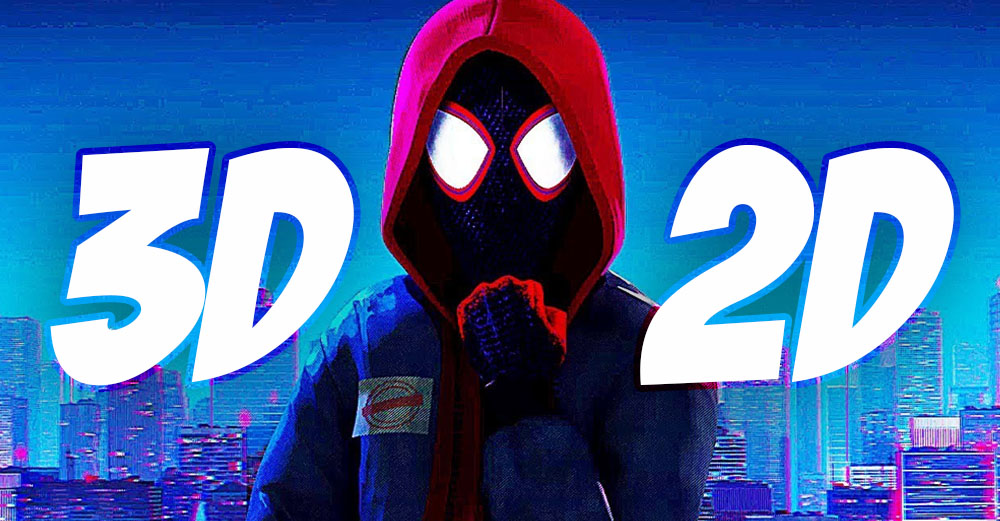
It doesn’t look like 3D animation, but it’s also not really 2D as we know it. So what is it?
Is this movie 2D or 3D?
When the industry first made the transition from traditional 2D to 3D computers animation, the shift was very clear. It was obvious that Toy Story looks completely different from Lion King. It was visually apparent.
Once the switch was made, the industry worked harder and harder to push the art form as much as possible. Getting better and better renders, producing more realistic results. Films looked better and better each year.
But there’s only so far we can push it.
At some point, all films just look amazing. The fidelity is incredible and there seem to be no limit to what we can produce with computer animation.
Then the question had to be asked – what’s next?
Now that we can make everything we can possible dream of – where do we go from here?
The people behind Spiderman Into the Spider-Verse found at least one answer to that question.
Playing with people’s expectations.
At this point we all know what to expect when we go to the movies to watch an animated film.
Yes, Disney has its style and Pixar is known for creating amazing worlds, and Illumination is still trying to go the other way with more edgy humor and cartoony character. Japanese anime is also rather visually predictable, and Laika has mastered stop motion to the point that it almost looks like a CG film.
Honestly, I got bored of animated films in recent years.
Sometimes I feel like I watch them because I have to. Like I need to be in on what’s new so I don’t get left out of the conversation. It became a chore.
It might be that I got older. But it also might be because most animated films feel the same.
From the first minute I sat in the theater to watch Into the Spider-Verse, I knew I was watching something different. I saw a change.
I felt something I haven’t felt in a very very long time: Watching something new.
The film kept playing with my expectations.
I found myself staring at the big screen, trying to figure out how they did this, or that.
I was like a student of animation all over again.
I fought the urge to pull out my phone and start taking notes on all the things they did different. I bounced between trying to analyze what I see to forcing myself to sit back and enjoy the experience.
Was it 2D or 3D? Who the hell cares? It broke all my expectations and dazzled me almost like a new genre of animation. A new D.
Of course, just to be clear, it’s not a new D. It’s 3D animation. But we’ll get to that in a minute.
If we want to break new grounds with animation, it’s up to us to come up with visual ideas that challenge our viewers in new ways. Go right when everyone goes left.
It’s not about making the art-form more sophisticated. It’s about using it in new and creative ways.
And now, because you did click on this post for the question posed in the title, let’s talk about the technical things this movie did different, from a professional point of view.
Making an Animated Short (FREE ebook)
A free ebook covering the process of making an animated short film from start to finish.
Getting a 2D look
As I mentioned before, Spiderman Into the Spider-Verse is a 3D animated film, not 2D.
By that I mean that the majority of what you see on screen was created with 3D models in a 3D software, and not by drawing the frames in a traditional 2D animation style.
They used 3D models and rigs for the characters and backgrounds in the movie.
However there were a few innovations they used to make it look different, mostly by adding 2D elements to the 3D assets.
They added line-work to the character’s face using 3D geometry, to give the artist more freedom in creating expressive poses. Here’s a video from Sony describing that process.
They also occasionally paused the film and overlaid the shot with a 2D illustration of that one frame, as a reminder that we’re basically inside of a comic book. They pushed that further by adding typography into some scenes, like cell phone rings, car screeches and some narration.
The team also painted over most of the frames and often used abstract backgrounds that resembled commercial motion graphics.
Visual decisions
In addition to creating specific tools for producing a 2D feel to the film, the creators made some very specific decisions for certain aspects of the art style.
These decisions played an important part in challenging our expectations. I broke them down to frame rate, motion blur and depth of field.
Frame rate
One of the most obvious creative decisions in the film regards to the animation frame rate.
Animated films are usually created in 24 frames/second, and this film is no different. However, the creators did something really interesting with the animation of the characters themselves, often reducing the animation to 12 frames/second (animating on 2’s).
Animating on 2’s is usually done in 2D animation, stop motion or anime. This means 1 new drawing every 2 frames.
When 3D animation came along, the animation was done on 1’s – meaning every frame within the 24 frames/second is changing.
Into the Spider-Verse still played on 24 frames/second, but the characters were often animated on 12 frames/second.
That pushed the 2D feeling even further and was one of the main elements that gave the film its now signature style.
Motion blur
Another major decision was to not use motion blur in its traditional sense.
In case you’re not familiar with motion-blur – it’s that blurriness that occurs when an object moves really fast on the screen.
That blurriness is technically a defect, seen in live action movies since the beginning. When 3D animation came along we had to recreate it, because viewers were already used to seeing it. They expect it.
But since we’re using a computer for the animation, we can easily turn it off. This usually doesn’t look so great, as every frame is extremely sharp and crisp. Motion blur makes the motion feels smoother and softer.
But the Spider-Verse people wanted to do it their way. They turned off motion blur, and instead added quick drawings between fast motions to give the feeling of motion blur. It’s a common trick in 2D animation, where motion blur can’t exist organically.
This decision allowed the artist to have even more control on how each shot looks, and again pushed the 2D hand-drawn feel further.
Depth of field
Lastly, the creators did something pretty interesting with depth of field.
Depth of field is the blurriness of objects that are not in focus. Usually the main object in each shot is in focus, while the background and foreground objects are blurry.
In Spider-Verse, in many cases when an object isn’t in focus, it starts splitting up into its RGB colors, similar to a phenomenon called chromatic aberration, in which objects on the edge of a frame start leaking their RGB colors.
This feature isn’t just unique, but it also pushes the comic book feel, since printed comic books often had color misaligning during printing, which causes some colors to offset.
Even at an almost unnoticeable level, this decision adds to the overall comic book look they have built.
Does any of this matter?
Yes and no.
It matters because a studio has created a visual masterpiece that challenged us as the viewers in new ways. That is no small task and not one to take for granted.
And yet it wouldn’t have mattered if the story itself wasn’t so solid. If any of the story elements such as acting, plot, pacing and humor didn’t work so well together – all of this visual extravagancy wouldn’t have mattered at all.
Well done, Sony. Well done.
Making an Animated Short (FREE ebook)
A free ebook covering the process of making an animated short film from start to finish.